'Websafe" colour palettes
I've been working on a new page for our website (coming soon, watch this space!) and wanted some of the text to be a different colour from the standard darkblue-ish colour (like this) that we use throughout the site.
Here's some recommended sites that depict the "websafe" 216 colour palettes (which are guaranteed to display properly in all browsers):
I've chosen a matching green and purple colours which blend well with the blue text of the rest of the site.
Here's some recommended sites that depict the "websafe" 216 colour palettes (which are guaranteed to display properly in all browsers):
- Web-source present a nice single page with the different hue's arranged in large banks
- Lynda Weinman presents the palettes in both hue and brightness sequence
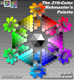
- And probably my favourite, Visibone show a "wheel" (see below) with similar tonal colours arranged together so you can easily choose complementary colours
I've chosen a matching green and purple colours which blend well with the blue text of the rest of the site.
posted by Geoffrey at 11:26 pm Permalink
![]()
![]()


0 Comments:
Post a Comment
<< Home