Running a French Holiday Gite in Rural Brittany

Tuesday, January 15, 2008

Fixing an annoying HTML/CSS "bug" in Firefox - underlining beneath a clickable image

Following on from yesterday's entry about being invited to join the top-400 Gites in france, when I added the GitesDeFrance.Info logo to the home page of our website I found that what had previously been a minor annoying HTML featurette now looked plain horrible ... the GDF logo had an unsightly blue underline right underneath it.

On the left hand column of the website I'd added the GDF.I logo and a text description and then wrapped them all up in a HTML tag so that clicking either the logo or the text would result in the link being clicked and the visitor being taken to the GDF website.

The guts of the HTML looked like this (I've stripped some of the detail out to make it clearer):

<a href=http://www.gitesdefrance.info/cgibin/rankem.cgi?id=aldo45 target=_blank><img alt=GitesdeFrance.info src=/images/gdf_logo.gif><br>We're in the top 400 Gites</a>

Which produces the desired results when viewed with Internet Explorer:

IE6 displaying an image embedded in a link - note no underlining of the image

but when viewed in Firefox, both the text link and the image are underlined which looks horrible:

Firefox's default display of images embedded with links - note the underlining decoration of the image

I'd previously ignored this problem with just the square Gitelink logo appearing on the website homepage, but with the circular GDF.I logo I couldn't leave it like this as the stray underline looks just plain wrong.

The problem is caused by Firefox applying different different priorities as to which CSS tags should be applied when or not. In the website CSS file I have the following style definitons:

a img {border:none }
a:link {color:#0033cc; text-decoration:underline; }

Which says that clickable images within <a> tags shouldn't be displayed with a border (the default HTML treatment is that they're displayed with a blue border), and that all text within links should be coloured blue and decorated with underlining.

Normally both of these sets of CSS rules are fine and everything looks fine in both IE and Firefox, but on the odd occasion where the above HTML construct is used of an <img> image and some text within the same <a> tag, then the text-decoration rule seems to take preference in Firefox and the image is underlined to show that it's a clickable image. It's probably because IE is ignoring some of the HTML display rules and Firefox isn't, but the result is I'm sure you'll agree unsightly.

I tried various attempts at resequencing the CSS and HTML to no avail, so turned to Google to see if anyone else had the same problem and whether there was a fix.

Sure enough, Google came up trumps as usual. Firstly I found a page on Coding Forums where someone else was having the self-same problem but the various solutions suggested didn't work, and then on IT Developer network's "the scripts" the same problem was described, and a fix to the problem, as well a good demonstration of how the fix works at http://services.ccagroup.co.uk/testlink3.html.

In essence all that needs to be done is change the image from being displayed as an inline element to being displayed as a block-level element. Once that's done the line underneath the box is no longer displayed and the problem goes away.

Or put more simply, all I had to do was to define a new "noul" class in the CSS file that would display the selected image as a block element:

a.noul img { display: block; }

and then apply that new style to the images within the <a> tags on the home page:

<a href=http://www.gitesdefrance.info/cgibin/rankem.cgi?id=aldo45 target=_blank class=noul><img src=/images/gdf_logo.gif>We're in the top 400 Gites</a>

The only other change that was needed was to remove the <br> in the <a> tag as displaying the image as a block element automatically means that the following text appears on a new line.

And job done, here's how the homepage now looks in Firefox (and IE still looks OK as well):

Image styled with display:block in Firefox

Labels: ,

Sunday, November 26, 2006

'Websafe" colour palettes

I've been working on a new page for our website (coming soon, watch this space!) and wanted some of the text to be a different colour from the standard darkblue-ish colour (like this) that we use throughout the site.

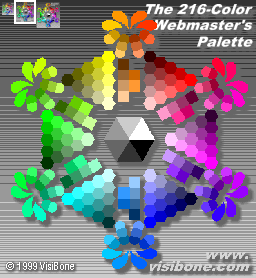
Here's some recommended sites that depict the "websafe" 216 colour palettes (which are guaranteed to display properly in all browsers):
  • Web-source present a nice single page with the different hue's arranged in large banks
  • Lynda Weinman presents the palettes in both hue and brightness sequence
  • And probably my favourite, Visibone show a "wheel" (see below) with similar tonal colours arranged together so you can easily choose complementary colours

I've chosen a matching green and purple colours which blend well with the blue text of the rest of the site.

Labels: ,

Tuesday, October 24, 2006

The deed is done - new holiday home website design finally launched!

Finally at 9:47pm tonight I clicked the 'publish' button in Rational's Software Development tool (which our Brittany Gite website is written in), and uploaded the new site design.

I've been writing about the evolution of the new design for some months now (most recently earlier this month when I finally settled on a new CSS based design and when I tested the new design with IE7), and since then I've been diligently applying the new design to all the pages of the site.

Most of the site design is actually generated from a single template and this takes care of ensuring that all the pages have a consistent look and feel and automatically generates the navigation structure down the left hand side. It's therefore been a matter of building the new template, applying it to each page, addingthe appropriate DIV sections to the HTML, then testing that it all works properly. Oh yes, then spell checking all the pages, and finally going through confirmed that all the external site links still worked - several of which didn't, and had to be corrected or removed.

I've still got more to do, there's new photos to add, new sections to add about additional local attractions and guest comments, but these are comparatively minor and can all come later. I'm pleased with the end result and hopefully web visitors will like it too.

Labels: ,

Monday, October 09, 2006

New Brittany Gite website design - finally settled on a design (part three)

Those readers with long memories will remember that way back in August I started talking about redesigning our Gite website, then in September I gave an update on progress, and now here we are in October, and I think I've finally concluded on a design that I like.

Well saying "I like" is a bit strong. I think I'd better say instead that I've come up with a design that I'm fairly happy with, works reasonably well, unfortunately doesn't fully do what I wanted, but it meets enough of my criteria to be worth adopting on the site.

And frankly after 3+ months of fiddling I'm getting bored with crafting standalone HTML & CSS so it's time to get on with other things (like improving all the photos on the site to make them larger).


Quick recap of what I was trying to do; instead of using tables to structure the main site elements (masthead, navigation bar, centre text and photos down the side), I wanted to adopt a more pure CSS 3 column layout that would enable me to:
  • Site navigation to be displayed in a left hand column
  • Main text to be positioned in the middle column and variable width so that it auto-expands to full screen width
  • Display supporting photos and pictures on the right
  • Include the middle column text first in the HTML file (i.e. before the navigation links and photos) so that search engines would give that text priority
  • Still look good if the font size was increased or decreased (so size everything in em's rather than px's)
  • Had to retain as much of the layout as possible on differing screen dimensions (width/height)
  • And it had to print properly

At the end of the last article I thought I was going to find my 'holy grail' with Position Is Everything's 'One True Layout'. Alas this was not to be and in fact I had terrible trouble with the layout, especially with smaller screen sizes when I found that the middle column of text just 'slid underneath' the pictures on the right hand side.

Eventually after much fiddling with the CSS I found the culprit, there was a

overflow: hidden;

clause on the main 'wrapper' DIVision which was intended to remove unnecessary padding at the end of the page, but was causing the pictures to stay in a fixed positition and the middle column text to 'flow underneath' the pictures when the screen width was decreased, rather than for the text to automatically shrink in width and increase in length as I wanted it to do when the screen width became narrower.

Much trial and error I concluded that this layout wasn't going to hack it for me and that the layout wouldn't autosize to fill the screen width. Looking more carefully at PositionIsEverything's boxes demo I realised that all the demos were for fixed width sites and the best I could do was to remove the overflow:hidden clause and then at least the text didn't disappear under the pictures with narrower widths, but instead the pictures dropped down to below the text, which frankly looked awful.
Here's yet another website homepage demo, styled this time using PIE's One True Layout.

It was at this stage that I was seriously thinking about giving up with this whole CSS idea and instead adopting a TABLE based approach or hybrid CSS/TABLE layout.

In one final desperate attempt to find a solution I looked again through the good CSS sites I've used before: A List Apart, Position Is Everything and Webcredible.

And on ALA's 'Thinking Outside the Grid' article I found a glimmer of hope with a link to Dave Shea’s Blood Lust, one of the designs he created for the CSS Zen Garden.

CSS Zen Garden is a marvellous site to explore if you're at all interested in the true power and beauty of CSS - there's a standard HTML page with several DIVisions of text, and web designers are invited to submit their own CSS design to reformat the standard page in any which way they can. The only rule is that the HTML must not be modified in any way, all the layout and design must lie in the CSS file. The more creative and unusual the better. Some of the Zen Garden designs are very clever and are worth studying to see their inner workings.

What I liked about Blood Lust was that it appeared to have solved my problem of columns appearing on screen in a sequence that differed from how they were laid out in the underlying HTML source.

So, much studying of Blood Lust's CSS, the standard HTML file, and trying to translate it onto the Gite homepage, I ended up with an almost perfect solution.

Firstly, here's the new sample demo homepage styled using Blood Lust concepts. So how does it measure up - well, it displays everything correctly in both Firefox and IE6, it's scalable for different font sizes, with increasing or reducing screen widths it scales nicely (the centre column just varies in width and the menu bar and pictures always remain visible), and when printed it fits the page properly with no truncation (a common mistake on all too many sites is that bits of the page disappear when you print them).

The one and only thing wrong with this design is that instead of the HTML contents being in the sequence {main text}{navigation bar}{photos} which was my 'holy grail', the contents instead are in the sequence {photos}{main text}{navigation bar} so search engines will "see" the photos and photo captions before they get onto indexing the main site text. It's probably better than the current TABLE-based structure of {navigation bar}{main text}{photos} as at least some relevant text will be read rather than some boring links such as 'Index', 'Getting there', 'The Gite', etc - but it's not quite what I wanted.

Try as I could I've not been able to fix this problem in a way that displays properly in both IE and Firefox. I did get to an alternative Blood Lust based design that meets all the above requirements plus has the DIV's sequenced the way I want in the HTML source (i.e. {main text}{navigation bar}{photos}), and it looks perfect in Firefox .... but it does NOT work in IE6. For reasons best known to Microsoft and its buggy browser, the photos resolutely appear under the main text despite there being a perfectly good space beside the text for them to slot into.

So where to now ? As I said right back at the start of this long diatribe, I've got fedup with all the time that I've spent chasing for that elusive, perfect, CSS layout that does everything I want. I can't find it, or at least the only design I can find doesn't work in IE ... and since 78% of my site visitors over the last month were using IE6, I can't really ignore them !

I think I will therefore go with this final layout I've ended up with. The colour scheme look and feel was inspired by Skidoo Too and the positional design by CSS Zen Garden's Blood Lust. I've some other ideas I want to get onto trying now, most important of which are redesigning the banner masthead and restyling the photos so they stand out more. I'd like to try to get as much of the new design rolled out quickly as I really don't want half of the site looking in one style and half in another - watch this space (or rather watch the Gite Website space!)

Labels: ,

Saturday, September 02, 2006

New Brittany Gite website design - still coming soon (part two)

Following on from my blog entry earlier in the month about changing the website design for our Brittany Gite, I've been carrying on trying to find the best HTML and CSS way to have a three column site layout with:
  • Website navigation on the left
  • Main text in the middle column
  • Supporting photos and pictures on the right
As I've already described I didn't want to use fixed width tables any more, I wanted to do the layout in a purely CSS manner, and I wanted the middle column text to appear first in the HTML file (i.e. before the navigation links and photos) so that search engines would give priority to that text.

It appears that this site design concept is somewhat of a 'holy grail' and there's several good attempts to solve just this problem out there....

First up I looked at the excellent website resource A List Apart who I've used in the past to help me write a CSS print stylesheet so that pages don't get truncated when printed.

A List Apart's most recent attempt to solve the 3 column layout problem's aptly called 'in search of the holy grail'. It's fairly simple in approach with DIV's for each of the navigation, text and picture columns; left and right padding to the centre text column in the CSS script (to leave space for the navigation and picture columns on either side); and then the three DIV's are positioned beside each other by using negative margins.

At first glance this appeared to work as required but as I tested it more I started to find problems; especially bad was if the browser window was resized bits of the site disappeared and reappeared, seemingly at random! Reading the comments and suggestions that other readers had put against ALA's article and after a lot of fiddling about with their suggestions I was able to fix most of the issues (in particular the resizing one), but unfortunately not all of them.

The final demo version of our homepage restyled using A List Apart's 3 column approach works OK in both IE6 and Firefox 1.5 for screen width's greater than 600, but for narrower screen sizes the navigation menu and pictures disappear off the edge of the screen (so bit of a problem that you can't navigate around the site!) and for reasons I can't explain (or fix despite lots of trying), IE doesn't always correctly colour the navigation menu bars, looking a bit naff. Other ALA readers have reported similar problems with background images so I guess it's IE bugs that are the root cause.

So after a week or so of trying ALA's approach I gave up and looked for another solution ... and found plenty of links to other sites trying to find the same holy grail mentioned in the discussion board for ALA's Holy Grail article.

One I haven't tried yet is Position is everything's 'Any Order Columns' design which at first glance seems to be very similar to A List Apart's Holy Grail. Maybe I will take the time to try it out, especially as the CSS seems to be simple (which gets my vote!).

The layout approach I've spent most of my time trying out (probably over 2 weeks on and off) is Skidoo Too, an adaptation of the existing skidoo layout. Here again is a test Gite website homepage, restyled using the skidoo layout.

What I really like about the Skidoo layout is the clean layout and simple colour scheme. After a few iterations of background colours and fonts I think I've ended up with a much easier to read site design that's less "cramped" with a larger font size and more white space between things.

The website navigation has a two level menu hierarchy with main sections (such as 'The Gite', 'Nearby attractions', 'Travel options', 'Rental availability', etc), and for some of these they're sub-divided into second level sub-pages (so 'The Gite' section has pages within it for 'Garden', 'Lounge', 'Bedrooms' and 'Kitchen').

Currently the site design uses a bulleted list for the left hand side navigation bar so that I could put circular bullets before the second level menu items (e.g. the sub-page about the Kitchen in our Gite within the Gite section). Getting the bullets to appear only on second level menu items and not the first took a lot of CSS fiddling (including negative indentation and the star-HTML hack) before it displayed properly in different browsers, but these CSS hacks will not work in Internet Explorer 7 without a re-write. So while I was trying out the Skidoo Too layout I decided to try simplify the approach from a combination of colours and bullets to just using different colours to distinguish navigation position within the site.

The new simpler navigation design has pale green level 1 menu items that turn dark green when you're viewing a main (level 1) page, and white sub-section (level 2) menu items that turn pale grey when you're looking at a sub-page. Demonstrations of how the menu now would look when viewing main site pages or sub-pages are also on the test Skidoo Too homepage.

The Skidoo Too CSS has lots of comments in it as to what each different element does and as I've said the resultant page looks a lot cleaner and easier to read. It also displays properly with a variety of different screen sizes in both Internet Explorer and Firefox (even with narrow screen sizes nothing disappears off the side and it's still readable, unlike ALA). The only concern I have with this template is that it uses 6 nested DIV's in the HTML to get everything to work properly. To my mind this is far too many, it makes the HTML hard to read and equally hard to edit and increases the chance of inadvertently breaking the site when making changes.

So right now I'm a bit undecided. I've some more changes I've been trialling to the banner 'masthead' at the top of the page, and maybe I'll test out Position is everything's 3 column design - wait for part three to see if I finally make a decision!

Meanwhile I'd be interested in what other people think about the potential new (Skidoo Too) design and whether it looks OK in their browsers.

Labels: ,

Friday, August 04, 2006

New Brittany Gite website design - coming soon (part one)

For the last few weeks I have been working on a redesign of our Brittany Gite website, and although it's still quite a long way from being finished I thought I'd share the work so far.

This is probably the most major redesign of the site I've done since it was first completed in January 2005 so if I'm going to go to all this effort then I'd really like to make sure that it's a step forwards rather than backwards - please comment as to what you think.

The first thing I've been doing is to break the text up on the page more and add subheadings so that it's both easier for the visitor to read the page quickly and (hopefully) it'll boost my search engine placement as well. Many of the search engines apparently place greater significance on the words within headings (such as <H1>) than on ordinary page text and as I originally never had any headings I was probably missing out. So far I've made this change to the travel options page and now the home page and I think they both look better as a result.


Next to tackle was the page width.

When I originally designed the site it was deliberately designed so that it viewed properly (without having to scroll left and right) on an 800 x 600 screen size. Looking at my website logs for 2005 and 2006 I feel that's still the right decision, it's the third most popular screen size and that's used by 13% of visitors to the site. However the majority of site visitors have 1024 x 768 (56%) or 1280 x 1024 (16%) screen sizes so I've been thinking for some time that I needed to redesign the site so that it takes advantage of the whole screen width.

My original design has used a fixed width HTML table (e.g. <TABLE> <TBODY> <TR> <TD> text ... etc) to position the 'masthead logo' at the top, the menu bar down the left, the main text in the middle and the pictures to the right. The great advantage of this approach is that it's relatively easy to do the HTML coding and it guarantees that the page text appears just where I want it to do. Unfortunately on a wider screen size the text all still appears fixed width with a lot of white space to the right hand side. Using a table for the website layout is hard to get it to expand to full screen width and this approach is now somewhat frowned upon - if possible a CSS solution is considered "better design".

The other problem with using tables is that everything has to appear in the HTML in the order it appears on the page from top to bottom, left to right. This means that first in the file is the header picture, then the menu text, then the main text, and finally the images. Although this all sounds logical it can cause problems for some search engines that attach more 'significance' to the earlier words in the HTML file. So a search engine reading my site would have to wade through 'Home', 'The Gite', Things to do and see', ... all the way to 'Site Map' before it got anywhere near the actual interesting stuff on the page. Some search engines only read the first few hundred characters in the file so with the approach I'd adopted I was potentially cutting down my search engine marketing effectiveness.

The first redesign attempt was to add DIV sections for the header, table of contents down the left hand side and the main site contents in the middle/right. I then used absolute positioning in the CSS file to position the DIV's in the appropriate places (e.g. #nav{ position:absolute; top:100px; } ) and it actually all worked pretty well.

There's a test version of the homepage restyled like this at http://www.giteinbrittany.com/test/index_pos.html and in both IE6 and Firefox 1.5 it looks good no matter what size you make the width or height.

However I have slightly cheated with this page as although it uses CSS to position the menu bar it still uses a table to position the pictures to the right of the main text.

Next challenge was to try to get a CSS solution working to position all elements of the page. My first attempt was to simply extend the 2 column approach, add an extra DIV around the pictures and position it using CSS. This didn't work properly on the first attempt as the text still expanded to full width and the images then appeared on top of the text. Putting a padding-right on the centre DIV (where the text is) that's the same width as the pictures fixed the problem.

Again, there's a test version of the homepage restyled like this at http://www.giteinbrittany.com/test/index_pos_3col.html. This looks pretty good in both IE6 and Firefox 1.5 until you reduce the screen width to less than 800 when the pictures start overlapping the text in Firefox (but strangely enough have no such problems in IE6). I've not worked out how to fix this particular issue - the CSS command 'min-width' should fix it but it doesn't appear to in Firefox.

So far the restyling has been fairly cosmetic. The next set of changes I've been trialling get far more radical ...

Labels: ,

Sunday, January 01, 2006

Happy New 2006

Happy new year !

2006 will be the second year of renting out our holiday Gite and it's starting out well with five bookings already.

Yesterday we had an enquiry from one of the families in our village about the Gite.
We hold most of the details of the property, photos, places to see, availability, etc on our website so the simplest way of providing a printed "information pack" would be to print off a selection of pages from the website.

Firstly though I needed to write a 'CSS print stylesheet' so that the normal website navigation menus wouldn't be printed - a quick google search to find a good CSS tutorial at A List Apart and the job was done. I still need to do some more work on the stylesheet as the right hand side of the page is truncated with Internet Explorer, but works fine with my favourite browser, Firefox, so I can leave this job for another time.

Receiving the enquiry was a timely reminder that I need to renew our advert in the village magazine. £40 for 6 issues to 280 houses in the village is not bad value for money and hopefully we'll be getting a booking as a result.

Labels: , ,