Our Declaration de Travaux was approved
I phoned our Mairie (mayor's office) during the week to ask about the declaration de travaux we submitted in May. As I've blogged before, I really don't like making telephone calls to France unless I really have to as it really makes me concious about how good my French isn't. Anyway, after 3 weeks of prevaricating I finally plucked up the courage to make the call, and is usual it wasn't as bad as I was expecting it to be, I was able to make myself understood, and found out that the travaux was actually approved in June, and that they'd sent me the approval then (which for some reason I hadn't received). Just the news I was hoping for as it means we can finally go ahead with the first step renovations to the old house - I phoned our builder and told him the good news.
Rewinding the story a bit and filling in some of the background to this momentous event ....
The main building we own in France is L shaped and like most older buildings has been built up over time. The bottom part of the 'L' was once a separate two bedded property and forms the bulk of what we currently rent out as a holiday home. Connected to this in the corner of the L is the most recent addition, a downstairs bathroom, boiler room, and upstairs corridor and third bedroom - collectively we call all this the new house house as it's comparatively the newest part; maybe some 50ish years old.
The rest of the 'L' (the upright) we refer to as the old house as this was once the original longere farmhouse. The walls are about 80cm thick (compared to the new house which are a mere 60cm) and outside you can see where the original thatch roof line was. Downstairs is one large room with a massive open fireplace, and upstairs the previous owner started converting into a liveable space and has built 3 bedrooms, none of which are truly finished. The old house is connected to the (rented out) new house by a doorway on the first floor which we normally leave locked thus disconnecting the two properties.
Next door to the old house is what was once the stable block for the farmhouse. Downstairs in the stables is a large room with animal feed troughs down each side and upstairs is the old hayloft.
The photo above shows the old house and stable block with our current Gite to the left. Since the photo was taken the outside stairs that went up to the hayloft have been taken down as they were unsafe.
When we bought the French house one of our desires was to buy somewhere that had some scope for being a future renovation project. It's our long-term aim to convert the old house into a second 3 bedroom Gite, and ultimately (funds and time permitting) to also convert the stable block into a third 3 bedroom Gite. All of this is some way down the track as although the old house and stables are water-tight they're both really just empty shells. Neither part has any heating, toilets or bathrooms, there's only a single cold water tap in the stable (no hot water), although there's electrics in place it's been done as a spur off the main house lights and hasn't been wired direct into the main fuseboard, etc, etc.
In other words there's a lot to do before we could even consider sleeping in there ourselves, let alone renting it out.
Although we're prepared and able to do quite a lot of the works ourselves we decided to kick start the renovations by getting a builder to do some of the initial work:
In April when we were over I dropped the form and the photos off. I had blown up some photos of the different sides of the Gite to show what it looked like before, and then drawn new windows and written 'nouveaux fenetre', etc on them to show where the new windows were to go. To be on the safe side my plans included all the window replacements (even through I don't think these need permission) as well as the two new windows, and we also submitted for permission to put in new velux's and windows in the stable block even though we're not planning on starting to convert that end any time soon.
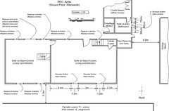
In May I received notification that our submission was incomplete and that we needed to provide before and after scale drawings of each elevation and floor level - unfortunately just drawing boxes to show where new windows were to go wasn't going to cut it with the Mairie.
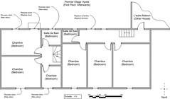
So when we were over at the Gite at the end of June we spent quite a bit of time measuring every dimension of the old house and carefully drawing up proper scaled drawings of each elevation and floor level using Microsoft Visio.
The big advantage I found of doing the drawings in Visio was that everything would be automatically scaled (e.g. to 1:75 or 1:100) even through it was a bit labour intensive to do each view manually. Doing the drawings meant that we could actually physically plan out where the windows, sockets and kitchen were going to be in the old house; and it's a good job we did as we found that our window sizes were too big and the windows were about 1m out from being lined up under the upstairs velux's - we'd forgotten to allow for the thickness of the exterior walls when measuring up. More re-measuring and re-drawing and it finally all fitted in place and the end result looked great.
We dropped the new plans off at the Mairie at the start of June and sat back and waited. And waited, and waited. You're supposed to hear either way within 2 months so after 4 months I was beginning to wonder what was happening - had the neighbours complained, was the Mairie still laughing about our poor explanations of where the new windows were to go? Finally plucked up the courage to phone them up only to find out that the approval was given on the 26th June and it was supposedly sent to me; but clearly never arrived.
I'm going over to the Gite next week for a week's working holiday so I'll call in at the Mairie and pickup a copy of the permit and we can finally commence works.
Rewinding the story a bit and filling in some of the background to this momentous event ....
The main building we own in France is L shaped and like most older buildings has been built up over time. The bottom part of the 'L' was once a separate two bedded property and forms the bulk of what we currently rent out as a holiday home. Connected to this in the corner of the L is the most recent addition, a downstairs bathroom, boiler room, and upstairs corridor and third bedroom - collectively we call all this the new house house as it's comparatively the newest part; maybe some 50ish years old.
The rest of the 'L' (the upright) we refer to as the old house as this was once the original longere farmhouse. The walls are about 80cm thick (compared to the new house which are a mere 60cm) and outside you can see where the original thatch roof line was. Downstairs is one large room with a massive open fireplace, and upstairs the previous owner started converting into a liveable space and has built 3 bedrooms, none of which are truly finished. The old house is connected to the (rented out) new house by a doorway on the first floor which we normally leave locked thus disconnecting the two properties.
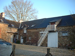
Next door to the old house is what was once the stable block for the farmhouse. Downstairs in the stables is a large room with animal feed troughs down each side and upstairs is the old hayloft.
The photo above shows the old house and stable block with our current Gite to the left. Since the photo was taken the outside stairs that went up to the hayloft have been taken down as they were unsafe.
When we bought the French house one of our desires was to buy somewhere that had some scope for being a future renovation project. It's our long-term aim to convert the old house into a second 3 bedroom Gite, and ultimately (funds and time permitting) to also convert the stable block into a third 3 bedroom Gite. All of this is some way down the track as although the old house and stables are water-tight they're both really just empty shells. Neither part has any heating, toilets or bathrooms, there's only a single cold water tap in the stable (no hot water), although there's electrics in place it's been done as a spur off the main house lights and hasn't been wired direct into the main fuseboard, etc, etc.
In other words there's a lot to do before we could even consider sleeping in there ourselves, let alone renting it out.
Although we're prepared and able to do quite a lot of the works ourselves we decided to kick start the renovations by getting a builder to do some of the initial work:
- Replacing the two windows and oak frames in the old house downstairs that overlook the courtyard between the two wings of the 'L'
- Replacing the upstairs door in the old house that opens above the courtyard with a new window and frame
- Putting in an upstairs bathroom, shower, sink and toilet to the old house
- Putting in two new windows in the rear wall of the old house lounge (not an enviable task as the walls are 2 feet thick!)
- Running hot and cold water pipes from the Gite into the old house
- Putting in a proper electric supply to the old house
In April when we were over I dropped the form and the photos off. I had blown up some photos of the different sides of the Gite to show what it looked like before, and then drawn new windows and written 'nouveaux fenetre', etc on them to show where the new windows were to go. To be on the safe side my plans included all the window replacements (even through I don't think these need permission) as well as the two new windows, and we also submitted for permission to put in new velux's and windows in the stable block even though we're not planning on starting to convert that end any time soon.
In May I received notification that our submission was incomplete and that we needed to provide before and after scale drawings of each elevation and floor level - unfortunately just drawing boxes to show where new windows were to go wasn't going to cut it with the Mairie.
So when we were over at the Gite at the end of June we spent quite a bit of time measuring every dimension of the old house and carefully drawing up proper scaled drawings of each elevation and floor level using Microsoft Visio.
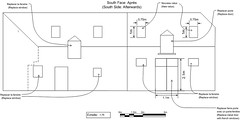
The big advantage I found of doing the drawings in Visio was that everything would be automatically scaled (e.g. to 1:75 or 1:100) even through it was a bit labour intensive to do each view manually. Doing the drawings meant that we could actually physically plan out where the windows, sockets and kitchen were going to be in the old house; and it's a good job we did as we found that our window sizes were too big and the windows were about 1m out from being lined up under the upstairs velux's - we'd forgotten to allow for the thickness of the exterior walls when measuring up. More re-measuring and re-drawing and it finally all fitted in place and the end result looked great.
We dropped the new plans off at the Mairie at the start of June and sat back and waited. And waited, and waited. You're supposed to hear either way within 2 months so after 4 months I was beginning to wonder what was happening - had the neighbours complained, was the Mairie still laughing about our poor explanations of where the new windows were to go? Finally plucked up the courage to phone them up only to find out that the approval was given on the 26th June and it was supposedly sent to me; but clearly never arrived.
I'm going over to the Gite next week for a week's working holiday so I'll call in at the Mairie and pickup a copy of the permit and we can finally commence works.
Labels: Renovations
posted by Geoffrey at 9:36 am Permalink
|0 comments
![]()
![]()